Knowledge base
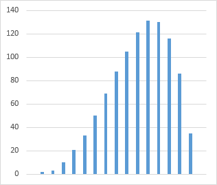
This isn’t specific to our software, but it’s a question that comes up a lot. How to create a histogram in Excel? Or more specifically, how to go from a standard column chart:

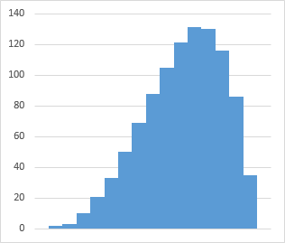
to a histogram:

It’s very simple to do. Right-click on one of the bars and select Format Data Series. Under Series Options, you’ll see a slider for Gap Width. Set that to zero for a classic histogram.
You can use the other settings in this window to make the chart arbitrarily fancy:
