Knowledge Base
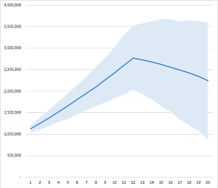
“Cone” charts are basically lines within regions, like this:

You can create them in Excel without too much difficulty, if you know the trick. The line on this chart is just a normal line chart. The cone area is actually a stacked area – there are two stacked areas, but the first one (the bottom) is invisible.
Here is the example file we used to create this chart:
To create a cone chart, you need three sets of values – in the example, we used the mean, 15th percentile, and 85th percentile. Before you create the chart, you need one more set of data: the difference between your “high” and “low” lines. That’s because it uses a stacked area, which accumulates value. In the example we use the 85th percentile minus the 15th percentile (labeled in the spreadsheet as “Delta”).
Once you have that, here are the steps to create a cone chart:
Insert a line chart with your three sets of data (middle, low, and delta). Usually it’s easiest to select one data set, create the chart, and then add the other data sets.
Once you have three lines on the chart, right-click one of them and select Change Series Chart Type…
On the left, select Combo. Change the middle and delta lines to Stacked Area.
Right-click the bottom area, and select Format Data Series… Change the Fill property to No Fill.
Beyond that, you can add lines around the cone, add shadows, and so on. It’s possible to create multiple regions using the same technique.
Search the Knowledge Base